
Volkswagen workers vote for union in Tennessee — a major win for organized labor
UAW claims historic victory, with an overwhelming majority of VW workers at Chattanooga factory voting to unionize.
Watch CBS News
UAW claims historic victory, with an overwhelming majority of VW workers at Chattanooga factory voting to unionize.

In the next day or two, bitcoin is expected to go through a preprogrammed event that will cut new production of the cryptocurrency.

Eliminating player "proposition" bets may be one way to discourage athletes from betting on sports, experts said.

Trump Media & Technology Group sent a letter to Nasdaq warning that so-called "naked" short selling could be impacting its stock.
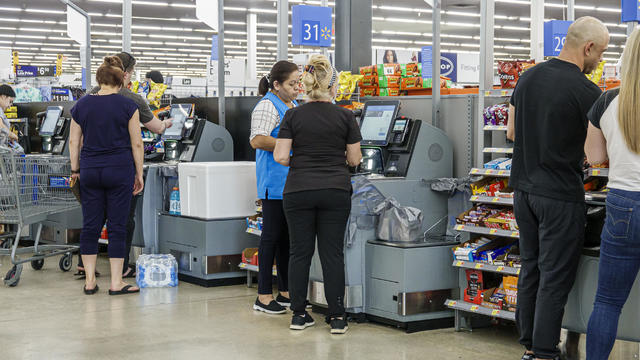
Retailers are ditching and limiting shelf-checkout at some stores, particularly those hit by theft and customer complaints.

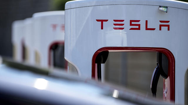
The MY 2024 Cybertrucks have faulty accelerator pedals that may be dislodged when high force is applied, the company said.

"Their job is to protect our investments," said one man whose bank account was drained of $15,000. "Otherwise, what's the point of putting it with a bank?"

Health officials are warning consumers not to consume the Infinite Herbs basil sold at Trader Joe's after 12 people were sickened.

Direct conflict between Israel and Iran, which threaten global oil supplies and could drive up energy costs, has investors on edge.

Considering adding gold to your retirement portfolio? Here's why you may want to act now.

Here's why long-term care insurance is a better way to plan for long-term care costs than paying on your own.

Borrowing your home equity could lead to savings compared to other options. Find out how much you'd save here.
Tesla accounted for 80% of electric vehicle sales in the U.S. in 2020, but that figure fell to 55% last year.
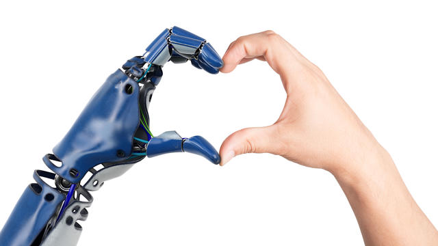
The generative artificial intelligence boom has led to the emergence of romantic companion bots.

Apple said it will stop selling the devices later this month in order to comply with a U.S. import ban.

Alex Jones, the conspiracy theorist known for his fake news site InfoWars and his false denial of the Sandy Hook massacre, was permanently banned from Twitter in 2018.
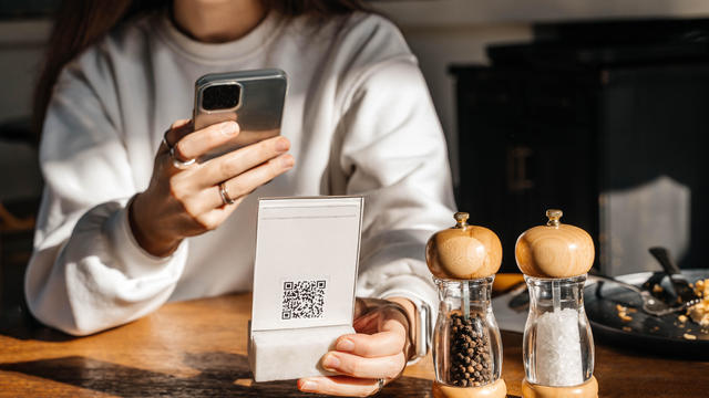
More than 90 million consumers will scan a QR code this year. But the technology can also facilitate identity theft.
The billionaire owner of X took a defensive tone, saying that "the whole world will know that those advertisers killed the company."
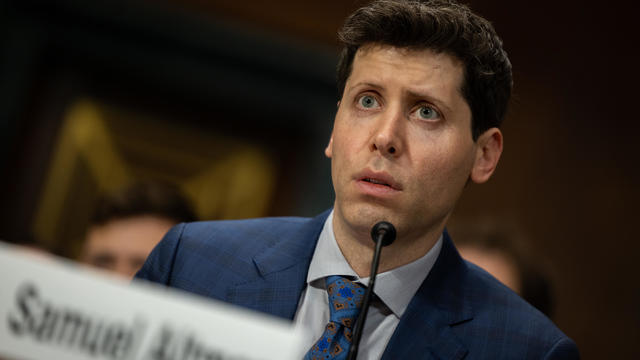
OpenAI co-founder Sam Altman says he's looking forward to returning to the company, with the support of Microsoft's CEO, to build the 2 companies' "strong partnership."

Musk, who is under fire for supporting an antisemitic post, said the money will be donated to hospitals in Israel and to the Red Cross in Gaza.
Altman landed at Microsoft, the biggest investor in OpenAI, as former Twitch leader Emmett Shear was named OpenAI's new chief executive.

The jury selection process in former President Donald Trump's New York trial came to a close on Friday, part of a flurry of activity that marked the end of a dizzying first week.
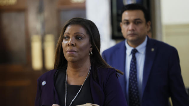
The New York attorney general filed the state's opposition to the company providing Donald Trump's $175 million bond, posted while his appeal is pending.

Niger has been home to a major U.S. airbase in the city of Agadez, some 550 miles from the capital Niamey, using it for manned and unmanned surveillance flights and other operations.

A person self-immolated at a park across from the courthouse where former President Donald Trump's New York criminal trial is taking place.

UAW claims historic victory, with an overwhelming majority of VW workers at Chattanooga factory voting to unionize.
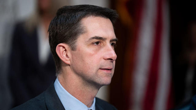
GOP Sen. Tom Cotton, of Arkansas, has been encouraging people to "take matters into your own hands" against pro-Palestinian protesters.
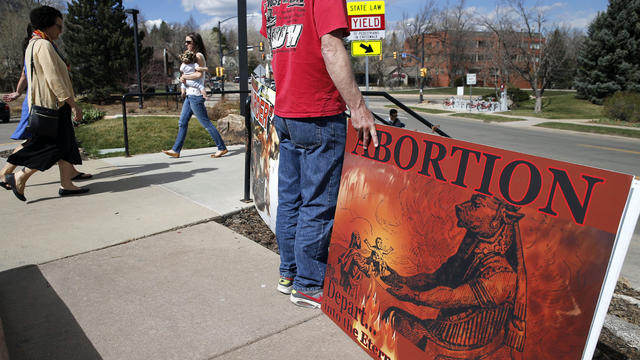
Only one of two opposing abortion ballot measures may qualify for the Colorado ballot this fall. An anti-abortion initiative failed to gather enough signatures.
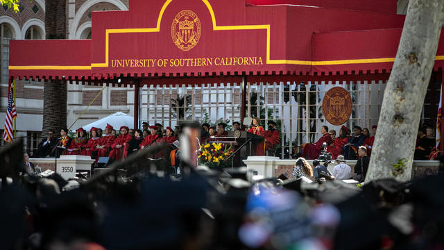
The administration had initially slated "Crazy Rich Asians" director Jon M. Chu as the commencement speaker.

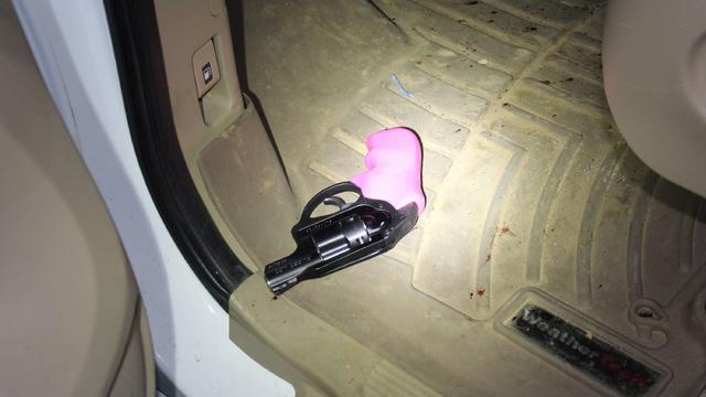
Texas state law says a child under the age of 10 doesn't have criminal culpability, law enforcement said.

The U.S. is reaching "peak 65," marking the largest retirement wave in American history. But the financial outlook for many is grim.

Americans are underprepared for retirement, with the average account holding just $88,400 in savings.
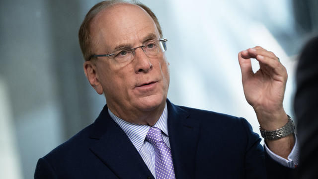
BlackRock CEO Larry Fink said that longer life expectancies are "putting the U.S. retirement system under immense strain."

About 1 in 8 workers think they'll retire by age 61. But the reality of saving for decades of expenses is daunting.

America's retirement system has left behind 90% of workers. "We see big gaps with the rich and the poor in terms of who gets to retire," one expert said.
GOP Sen. Tom Cotton, of Arkansas, has been encouraging people to "take matters into your own hands" against pro-Palestinian protesters.
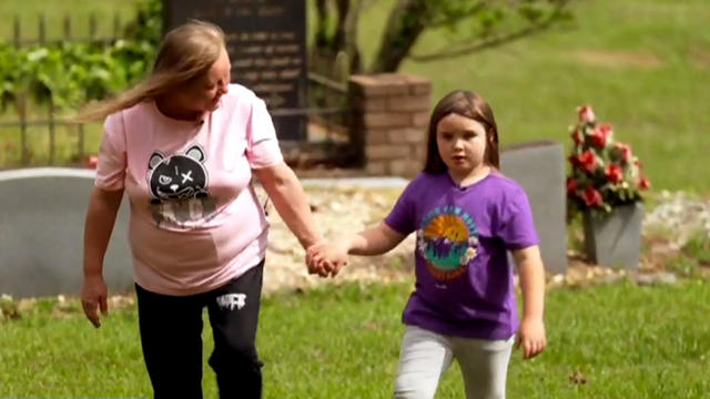
The first time Emouree went to the cemetery with her grandmother, she couldn't understand why everyone else got a giant granite headstone, but her mother just received a tiny metal one.
Texas state law says a child under the age of 10 doesn't have criminal culpability, law enforcement said.
Only one of two opposing abortion ballot measures may qualify for the Colorado ballot this fall. An anti-abortion initiative failed to gather enough signatures.

Taylor Swift broke her own records, Spotify said, and now owns the record for the top three most-streamed albums in a single day.
UAW claims historic victory, with an overwhelming majority of VW workers at Chattanooga factory voting to unionize.
In the next day or two, bitcoin is expected to go through a preprogrammed event that will cut new production of the cryptocurrency.
Retailers are ditching and limiting shelf-checkout at some stores, particularly those hit by theft and customer complaints.
Eliminating player "proposition" bets may be one way to discourage athletes from betting on sports, experts said.
Trump Media & Technology Group sent a letter to Nasdaq warning that so-called "naked" short selling could be impacting its stock.
GOP Sen. Tom Cotton, of Arkansas, has been encouraging people to "take matters into your own hands" against pro-Palestinian protesters.
Niger has been home to a major U.S. airbase in the city of Agadez, some 550 miles from the capital Niamey, using it for manned and unmanned surveillance flights and other operations.
Only one of two opposing abortion ballot measures may qualify for the Colorado ballot this fall. An anti-abortion initiative failed to gather enough signatures.

The RNC announced an ambitious initiative to monitor vote processing in the 2024 presidential election.
The New York attorney general filed the state's opposition to the company providing Donald Trump's $175 million bond, posted while his appeal is pending.
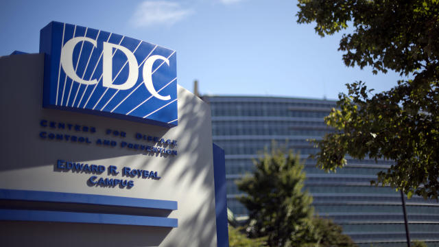
The CDC estimates the U.S. could reach 300 measles cases in 2024 — more than the recent peak two years ago.
Health officials are warning consumers not to consume Infinite Herbs basil sold at some Trader Joe's and Dierberg's stores after 12 people were sickened.
A landmark review for Britain's National Health Service found young people have been let down by "remarkably weak" evidence backing medical interventions in gender care.
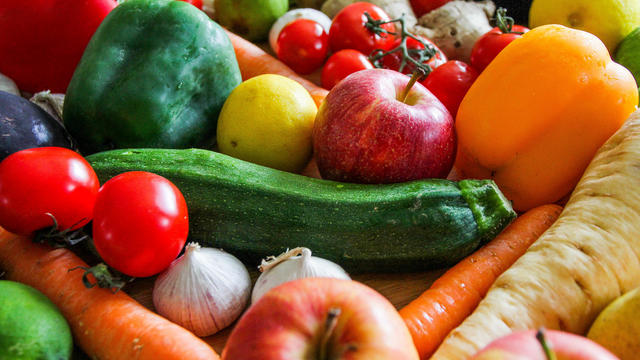
Organic option is best when buying certain produce, especially blueberries, nonprofit group says in analysis of chemical residues.
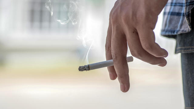
British lawmakers have backed legislation that would see the legal age to buy tobacco increase by one year every year until it's eventually banned.
Niger has been home to a major U.S. airbase in the city of Agadez, some 550 miles from the capital Niamey, using it for manned and unmanned surveillance flights and other operations.

North Korea's latest launch to boost Kim Jong Un's image wasn't a missile, but a song and music video all about the "Friendly Father."
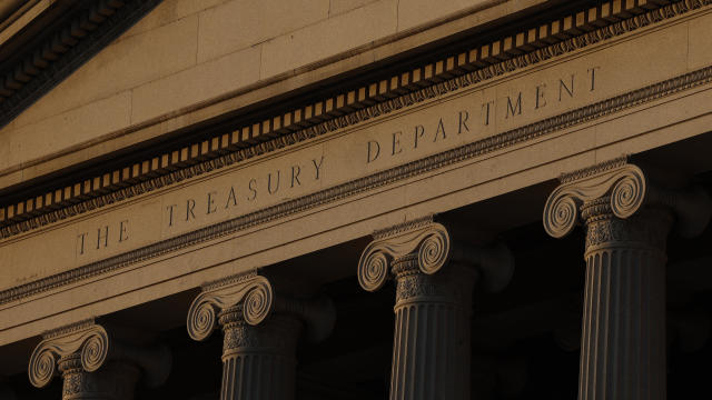
The Treasury Department announced sanctions on two entities accused of fundraising for extremist West Bank settlers connected to violence against Palestinians.

The break in tradition does not sit well with the Association of Summer Olympic Committee, who said it undermines "the value of Olympism and the uniqueness of the games."
The Vasuki indicus specimen dates back 47 million years and is more than double the average size of similar snakes, like pythons.
Taylor Swift broke her own records, Spotify said, and now owns the record for the top three most-streamed albums in a single day.
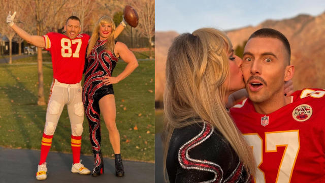
Charlie Bird — the "major Swiftie" of the two — had the idea after the singer announced her new album "The Tortured Poets Department" at the Grammys.

The singer was found deceased at her home, a representative said.

The soprano recounted an anecdote from the book's foreword by Francis Collins, which describes an impromptu sing-along at a dinner party attended by Supreme Court justices.

Fans are furiously dissecting the lyrics of "The Tortured Poets Department," with some speculating the tracks are about Joe Alwyn, Matty Healy, Travis Kelce and Kim Kardashian.

Computer chip maker Intel is at the center of the latest high-tech race between the U.S. and China. Jo Ling Kent visited their state-of-the-art facility in Oregon for an in-depth report.
A bipartisan group of lawmakers has introduced a bill supporting the development of nuclear fusion power. Hank Jenkins-Smith, professor of public policy at the University of Oklahoma, joins CBS News to discuss.

From labor shortages to environmental impacts, farmers are looking to AI to help revolutionize the agriculture industry. One California startup, Farm-ng, is tapping into the power of AI and robotics to perform a wide range of tasks, including seeding, weeding and harvesting.
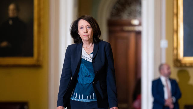
Sen. Maria Cantwell is backing an amended bill that could lead to a ban of TikTok in the U.S.

Artificial intelligence has become so advanced it has now surpassed human performance in several basic tasks, according to a new report from Stanford University's Institute for Human-Centered Artificial Intelligence. Russell Wald, deputy director of the institute, joins CBS News to unpack more key findings from the study.
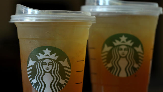
Starbucks unveiled the new cups ahead of Earth Day and as a new report warns plastic production emissions are even greater than those from aviation.
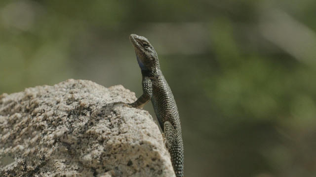
A report from the United Nations determined that 1 million species are threatened with extinction. Dr. John Wiens from the University of Arizona believes that number is far higher based on his research. He says climate change is quickening the threat of extinction for species, including a 3-million-year-old lizard population previously found in the Arizona mountains.
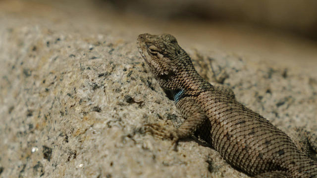
A disappearing lizard population in the mountains of Arizona shows how climate change is fast-tracking the rate of extinction.
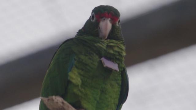
Some of the most critically endangered birds on the planet have been released back into the wild. CBS News national environmental correspondent David Schechter has more on the harsh conditions Puerto Rican parrots face, and the people working to save them.

Scientists are using a range of tools to protect the endangered wildlife that could disappear in coming decades.
In 2019, prosecutors charged a Florida man with killing his brother, father and mother so he could steal $200,000 to spend on a model from Bulgaria who he met online. A new Paramount+ docuseries, "CTRL+ALT+DESIRE," investigates the triple murder. Director Colin Archdeacon joins CBS News to discuss the making of the series.
Texas state law says a child under the age of 10 doesn't have criminal culpability, law enforcement said.

Police in Maryland say they stopped a teenager who was planning a school shooting in the days ahead. An 18-year-old student was arrested and charged after authorities reviewed the teen's writings and internet searches. Nicole Sganga reports on what led authorities to the suspect.
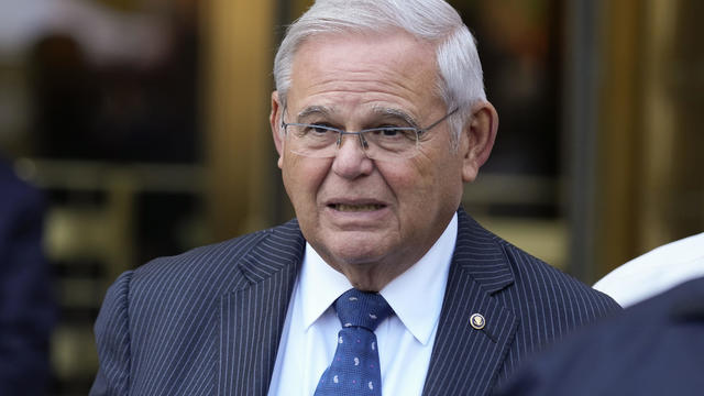
A judge granted a one week delay in the corruption trial of New Jersey Sen. Bob Menendez Friday, but the senator was not physically in court. He joined the proceedings by phone.
Hundreds of teens had skipped school to meet in the Greenbelt, Maryland, park for a water gun fight, police said.
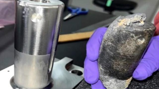
NASA confirmed Monday that a mystery object that crashed through the roof of a Naples, Florida home last month was space junk from equipment discarded by the space station.
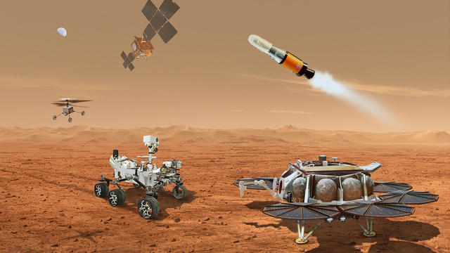
NASA said it agrees with an independent review board that concluded the project could cost up to $11 billion without major changes.

It was a "bittersweet moment" as United Launch Alliance brought the Delta program to a close.

NASA flight engineers managed to photograph and videotape the moon's shadow on Earth about 260 miles below them.

Millions of Americans poured into the solar eclipse’s path of totality to watch in wonder. The excitement was shared across generations for the rare celestial event that saw watch parties across the country as almost all of the continental U.S. saw at least a partial solar eclipse.
A look back at the esteemed personalities who've left us this year, who'd touched us with their innovation, creativity and humanity.

The Francis Scott Key Bridge in Baltimore collapsed early Tuesday, March 26 after a column was struck by a container ship that reportedly lost power, sending vehicles and people into the Patapsco River.
When Tiffiney Crawford was found dead inside her van, authorities believed she might have taken her own life. But could she shoot herself twice in the head with her non-dominant hand?

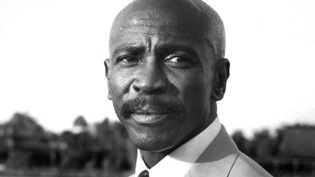
We look back at the life and career of the longtime host of "Sunday Morning," and "one of the most enduring and most endearing" people in broadcasting.

Cayley Mandadi's mother and stepfather go to extreme lengths to prove her death was no accident.
In 2019, prosecutors charged a Florida man with killing his brother, father and mother so he could steal $200,000 to spend on a model from Bulgaria who he met online. A new Paramount+ docuseries, "CTRL+ALT+DESIRE," investigates the triple murder. Director Colin Archdeacon joins CBS News to discuss the making of the series.

U.S. officials say Israel launched a small number of missiles at Iran on Friday in retaliation for Iran's missile attack against Israel last week. CBS News national security contributor Sam Vinograd joins with analysis.
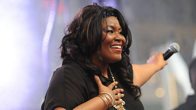
Grammy-winning singer Mandisa was found dead in her home on Thursday, according to her representative. She first rose to fame after finishing ninth on the fifth season of "American Idol."

Iranian officials are downplaying an early Friday Israeli military strike near the city of Isfahan in central Iran. CBS News' Debora Patta and Weijia Jiang have more.
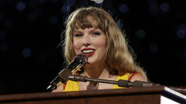
Taylor Swift released her 11th studio album, "The Tortured Poets Department," at midnight Eastern on Friday, but the excitement didn't end there. The pop star surprised fans with an additional 15 tracks two hours later. Steven Sullivan, a longtime fan with a heavily-followed Taylor Swift TikTok account, joins CBS News to share his thoughts on the record.