
FTC bans noncompete agreements, making it easier for workers to quit. Here's what to know.
Regulators prohibit new noncompetes, which impede millions of U.S. workers from getting a better job.
Watch CBS News
Regulators prohibit new noncompetes, which impede millions of U.S. workers from getting a better job.
Former President Donald Trump could receive a large windfall from his newly public media company, Trump Media & Technology Group.
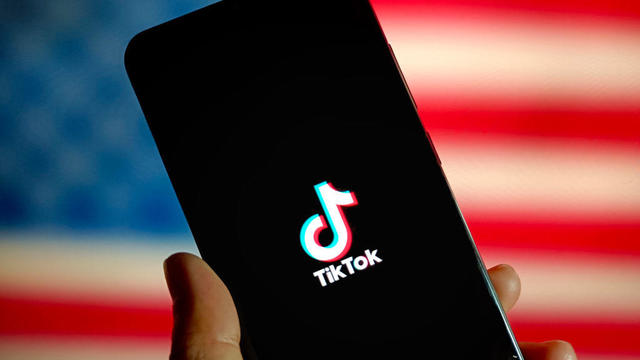
Senators give the green light to a foreign aid package that includes a possible ban on TikTok in the U.S. Here's what experts say could happen next.
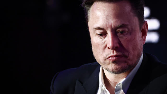
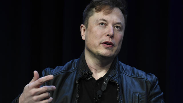
Tesla reports slide in earnings and revenue, but investors cheered by pledge to accelerate rollout of cheaper vehicles.
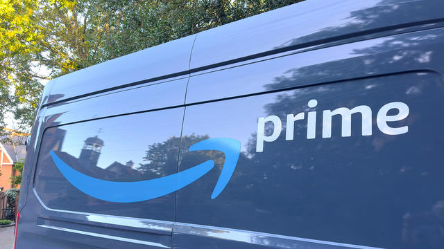
Customers who rely on government assistance programs can get same perks as Prime members, for less.

UnitedHealth said it paid the criminals behind attack that crippled hospitals and pharmacies to protect sensitive patient data.
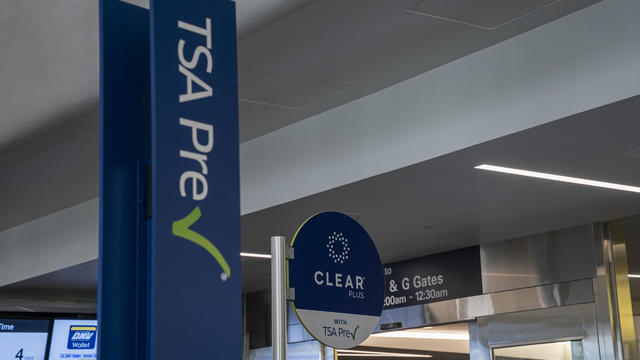
A "concierge service" that lets paying members bypass airport security lines is unfair to other travelers, California lawmaker says.
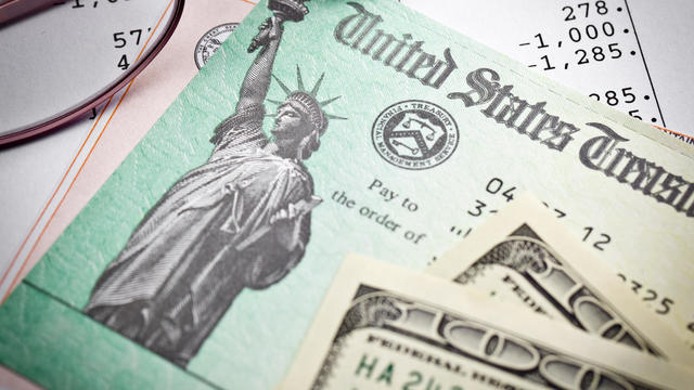
Millions of Americans filed their taxes during the last two weeks of this year's tax season. Here's how to find out when you'll get your refund.
Proposed deal "threatens to deprive consumers of the competition for affordable handbags," federal agency says.

How much money can you save by paying off $20,000 in credit card debt with your home equity? Find out now.

A mortgage loan denial is disheartening, but there are ways to improve your chances of future approval.

If you're looking for ways to resolve your overwhelming credit card debt, these strategies are worth considering.
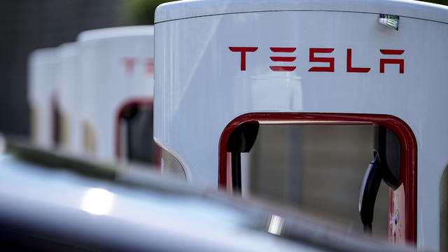
Tesla accounted for 80% of electric vehicle sales in the U.S. in 2020, but that figure fell to 55% last year.
The generative artificial intelligence boom has led to the emergence of romantic companion bots.

Apple said it will stop selling the devices later this month in order to comply with a U.S. import ban.
Alex Jones, the conspiracy theorist known for his fake news site InfoWars and his false denial of the Sandy Hook massacre, was permanently banned from Twitter in 2018.
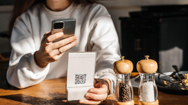
More than 90 million consumers will scan a QR code this year. But the technology can also facilitate identity theft.
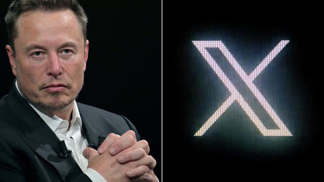
The billionaire owner of X took a defensive tone, saying that "the whole world will know that those advertisers killed the company."
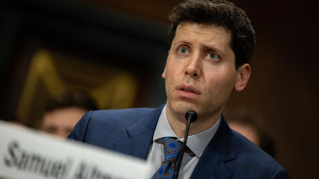
OpenAI co-founder Sam Altman says he's looking forward to returning to the company, with the support of Microsoft's CEO, to build the 2 companies' "strong partnership."
Musk, who is under fire for supporting an antisemitic post, said the money will be donated to hospitals in Israel and to the Red Cross in Gaza.
Altman landed at Microsoft, the biggest investor in OpenAI, as former Twitch leader Emmett Shear was named OpenAI's new chief executive.
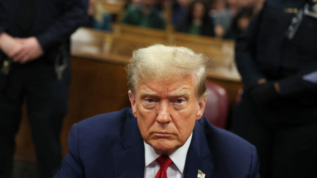
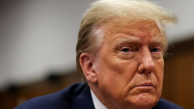
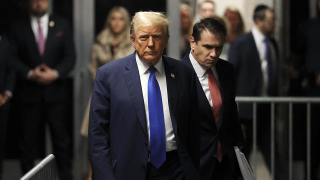
Jurors in Donald Trump's trial in New York heard testimony from a former media executive about his efforts to bury negative stories about Trump before the 2016 presidential election.

Antisemitic chants and even threats against Jewish students have brought the tension of the Middle East onto U.S. college campuses.
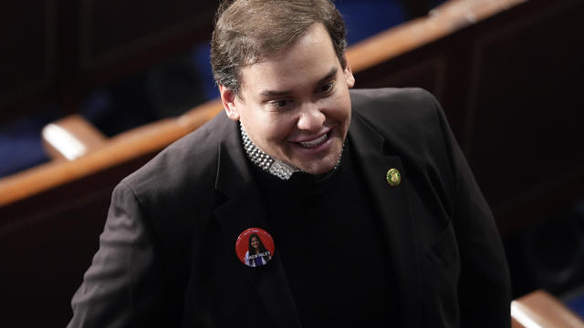
Former New York Rep. George Santos is no longer running for Congress, he announced Tuesday on X.

The Federal Aviation Administration said the aircraft was carrying two people at the time.
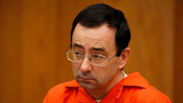
Over 100 victims of Larry Nassar, who was convicted of sexual abuse and child pornography, will receive a settlement from the Justice Department.
The Senate advanced the foreign aid package, which includes a provision that could lead to a ban on TikTok, after months of disagreement in Congress.
Larry Webb confessed to shooting and killing Susan and Natasha "Alex" Carter, who had been missing for 24 years, officials said.
Former President Donald Trump could receive a large windfall from his newly public media company, Trump Media & Technology Group.
Surprise guests, a broken foot and a history-making headliner.

The U.S. is reaching "peak 65," marking the largest retirement wave in American history. But the financial outlook for many is grim.

Americans are underprepared for retirement, with the average account holding just $88,400 in savings.
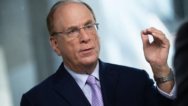
BlackRock CEO Larry Fink said that longer life expectancies are "putting the U.S. retirement system under immense strain."

About 1 in 8 workers think they'll retire by age 61. But the reality of saving for decades of expenses is daunting.

America's retirement system has left behind 90% of workers. "We see big gaps with the rich and the poor in terms of who gets to retire," one expert said.
Tesla reports slide in earnings and revenue, but investors cheered by pledge to accelerate rollout of cheaper vehicles.
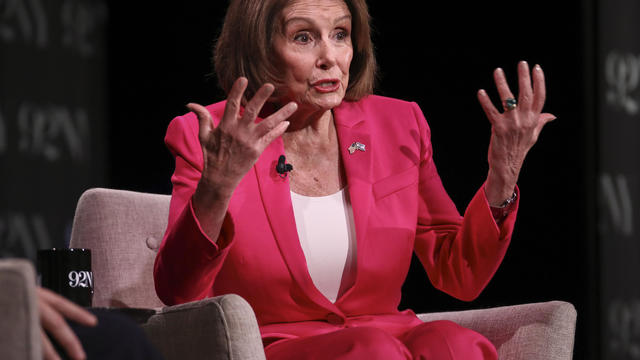
"He's ultimately responsible," former House Speaker Nancy Pelosi said of Israeli Prime Minister Benjamin Netanyahu.
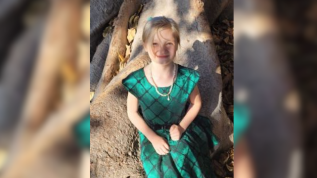
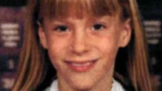
Don Steven McDougal, a family friend, was indicted by a Polk County grand jury in connection with the death of an 11-year-old girl.

The Federal Aviation Administration said the aircraft was carrying two people at the time.
Trump's bid for sweeping immunity lands before the Supreme Court, which will hear a case Thursday over whether he can face federal charges related to an alleged effort to overturn the 2020 election.
Tesla reports slide in earnings and revenue, but investors cheered by pledge to accelerate rollout of cheaper vehicles.
Regulators prohibit new noncompetes, which impede millions of U.S. workers from getting a better job.
Customers who rely on government assistance programs can get same perks as Prime members, for less.
UnitedHealth said it paid the criminals behind attack that crippled hospitals and pharmacies to protect sensitive patient data.
Former President Donald Trump could receive a large windfall from his newly public media company, Trump Media & Technology Group.
"He's ultimately responsible," former House Speaker Nancy Pelosi said of Israeli Prime Minister Benjamin Netanyahu.
Former New York Rep. George Santos is no longer running for Congress, he announced Tuesday on X.
Trump's bid for sweeping immunity lands before the Supreme Court, which will hear a case Thursday over whether he can face federal charges related to an alleged effort to overturn the 2020 election.
Jurors in former President Donald Trump's trial in New York heard testimony from a former media executive about his efforts to bury negative stories about Trump before the 2016 presidential election.
Regulators prohibit new noncompetes, which impede millions of U.S. workers from getting a better job.
UnitedHealth said it paid the criminals behind attack that crippled hospitals and pharmacies to protect sensitive patient data.
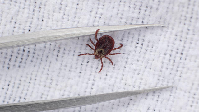
Warmer weather is prime time for ticks that can carry Lyme disease and other illnesses. Here's how to spot them and get rid of them.
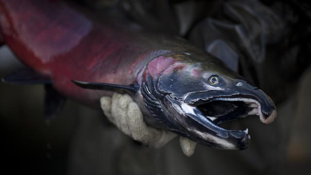
Tires emit huge volumes of particles and chemicals as they roll along the highway, and researchers are only beginning to understand the threat. One byproduct of tire use, 6PPD-q, is in regulators' crosshairs after it was found to be killing fish.
Cancer, heart disease, respiratory illnesses and kidney dysfunction among the health consequences of a warming planet.
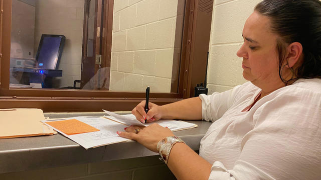
To reduce recidivism, some rural counties are hiring community health workers or peer support specialists to connect people leaving custody to mental health, substance use treatment, medical services and jobs.
"He's ultimately responsible," former House Speaker Nancy Pelosi said of Israeli Prime Minister Benjamin Netanyahu.
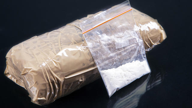
Six men have been arrested on suspicion of involvement in the drug's transport, a Swedish customs official said.

The Netzah Yehuda Battalion of the Israel Defense Forces has faced criticism for its conduct. Will the U.S. take action?

At least 77 students from the women-only college at Cambridge University were recruited to the code breaking station during World War II.
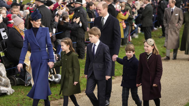
The photo of Prince Louis is said to have been taken by his mother Catherine, Princess of Wales.
Surprise guests, a broken foot and a history-making headliner.
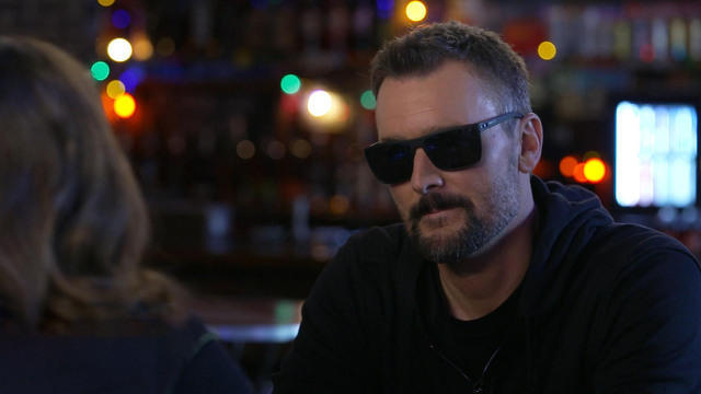
Eric Church is revered as one of country music's most respected figures, often described as Nashville's renegade. But he admits that even after his success, he sometimes still sees himself as an outsider.

Angel Carter Conrad talks about her brother Aaron Carter, his death and how she hopes his legacy and previously unheard music can help others.
Emmy and Tony Award-winning actress Bebe Neuwirth is back on Broadway, starring as Fraulein Schneider in the new revival of "Cabaret."
Chanel Miller, celebrated for her profound memoir "Know My Name," steps into a new creative realm with her children's book, "Magnolia Wu Unfolds It All." The story, both written and illustrated by Miller, follows two young friends on an adventurous quest through New York City to return misplaced socks from Magnolia's parents' laundromat.
Customers who rely on government assistance programs can get same perks as Prime members, for less.
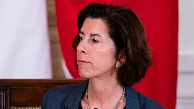
Secretary of Commerce Gina Raimondo is at the center of a global competition for semiconductor dominance. It's a battle that also puts her at the center of two of the hottest global national security hotspots. Lesley Stahl of 60 Minutes spoke with Raimondo for the broadcast.

From labor shortages to environmental impacts, farmers are looking to AI to help revolutionize the agriculture industry. One California startup, Farm-ng, is tapping into the power of AI and robotics to perform a wide range of tasks, including seeding, weeding and harvesting.
Senators give the green light to a foreign aid package that includes a possible ban on TikTok in the U.S. Here's what experts say could happen next.
More than 100 nations, including the United States, have agreed to protect 30% of the world's oceans by 2030.
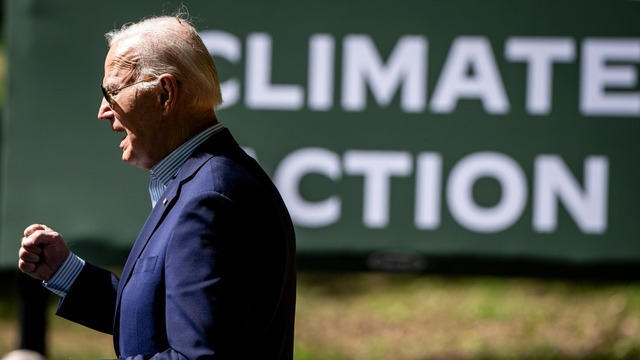
Relatively few Americans say they know a lot about President Biden's initiatives to combat climate change, according to a CBS News poll. Carolyn Kissane, a New York University global affairs associate dean and professor, joins CBS News with more on Biden's climate policies.

A photo taken two days after the sinking of the RMS Titanic apparently shows the iceberg that doomed the so-called unsinkable ship in 1912. CBS News' John Dickerson has details.
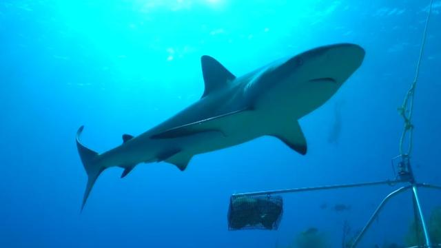
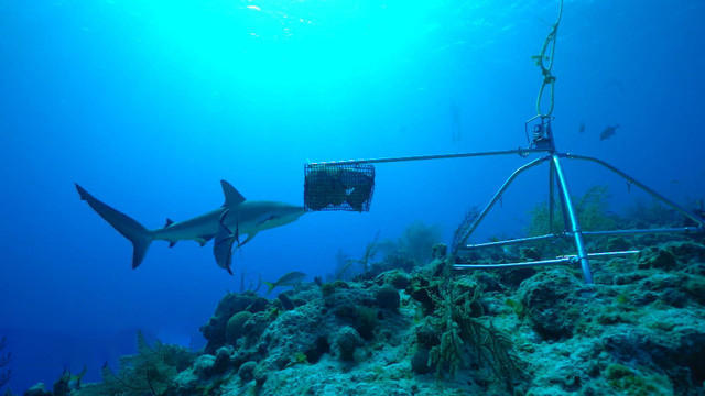
Despite how terrifying sharks might seem, the creatures are critical to the survival of the world's oceans. Oceans generate 50% of the oxygen on the planet and absorb 90% of excess heat created by global warming. CBS News senior national and environmental correspondent Ben Tracy spoke with conservationists in the Bahamas.
A new CBS poll finds that most of the public favors the U.S. taking steps to address climate change. CBS News executive director of elections and surveys Anthony Salvanto breaks down the numbers.

Climate change could cause a $38 trillion income loss per year globally by 2049, according to a new study by the Potsdam Institute for Climate Impact Research. CBS News' Lilia Luciano breaks down the numbers.
Don Steven McDougal, a family friend, was indicted by a Polk County grand jury in connection with the death of an 11-year-old girl.
Six men have been arrested on suspicion of involvement in the drug's transport, a Swedish customs official said.
Larry Webb confessed to shooting and killing Susan and Natasha "Alex" Carter, who had been missing for 24 years, officials said.
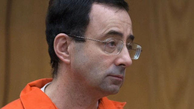
The Justice Department announced a $138.7 million settlement with victims of former USA Gymnastics physician Larry Nassar. The civil settlement stems from allegations that the FBI failed to properly investigate sexual abuse claims against Nassar. CBS News Justice Department reporter Robert Legare has more.
Over 100 victims of Larry Nassar, who was convicted of sexual abuse and child pornography, will receive a settlement from the Justice Department.
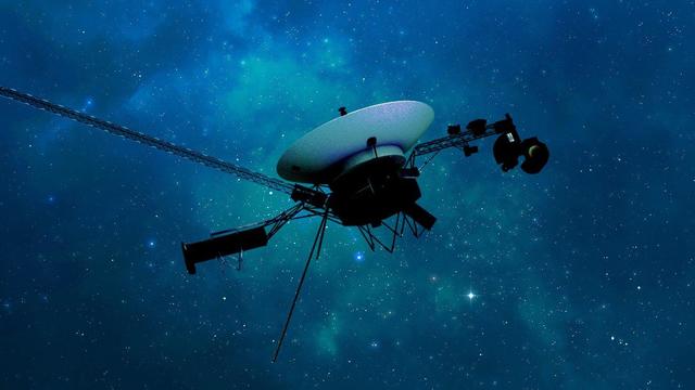
In November 2023, NASA's Voyager 1 spacecraft stopped sending "readable science and engineering data."
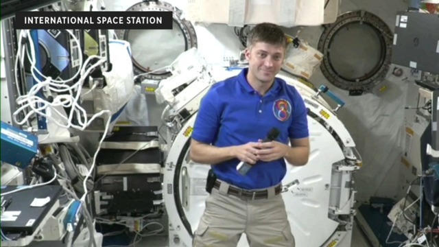
In two weeks, Boeing's Starliner spacecraft is scheduled to launch its first piloted test flight, bringing two veteran NASA astronauts to the International Space Station. Astronaut Matt Dominick joined CBS News from the ISS to talk about the mission and life in space.

A process called cryopreservation allows cells to remain frozen but alive for hundreds of years. For some animal cells, the moon is the closest place that's cold enough.
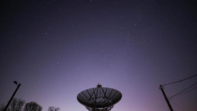
The Lyrid meteor show is set to peak as the week begins.

April's full moon, known as the Pink Moon, will reach peak illumination on Tuesday, but it will appear full from Monday morning through Thursday morning.
A look back at the esteemed personalities who've left us this year, who'd touched us with their innovation, creativity and humanity.

The Francis Scott Key Bridge in Baltimore collapsed early Tuesday, March 26 after a column was struck by a container ship that reportedly lost power, sending vehicles and people into the Patapsco River.
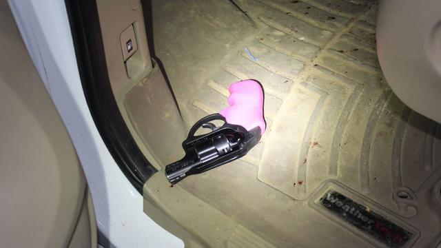
When Tiffiney Crawford was found dead inside her van, authorities believed she might have taken her own life. But could she shoot herself twice in the head with her non-dominant hand?
We look back at the life and career of the longtime host of "Sunday Morning," and "one of the most enduring and most endearing" people in broadcasting.

Cayley Mandadi's mother and stepfather go to extreme lengths to prove her death was no accident.
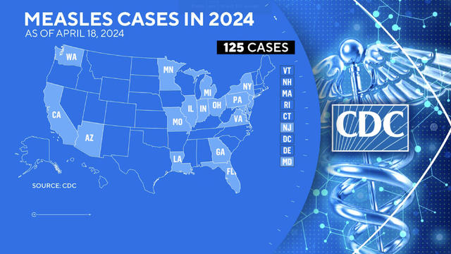
At least 125 measles cases have been reported across 17 states so far this year, according to the Centers for Disease Control and Prevention. That's more cases reported this year than in all of 2022, the most recent peak. CBS News' Nicole Sganga reports.

Construction has begun for a high-speed rail that would connect Los Angeles to Las Vegas by 2028. Pasi Lautala, the director of Michigan Tech University's Rail Transportation Program, joins CBS News with more.
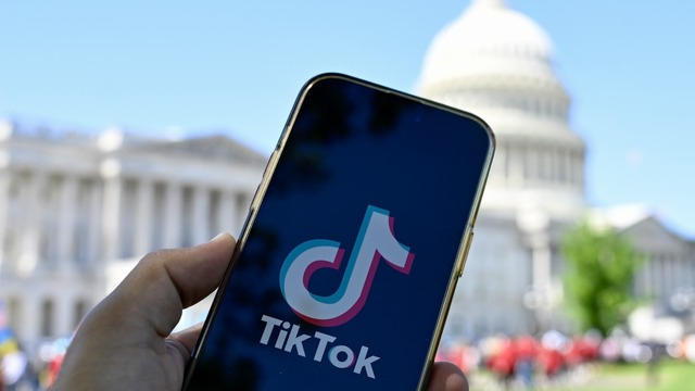
The Senate is considering a bill passed by the House that would force ByteDance, TikTok's current owners, to sell the popular social media app. CBS News senior business and tech correspondent Jo Ling Kent breaks down how a forced sale would take place.
President Biden is visiting Tampa, Florida, Tuesday to campaign on federal abortion measures and reproductive rights as more states take up bans and restrictions. CBS News campaign reporter Aaron Navarro has the latest.
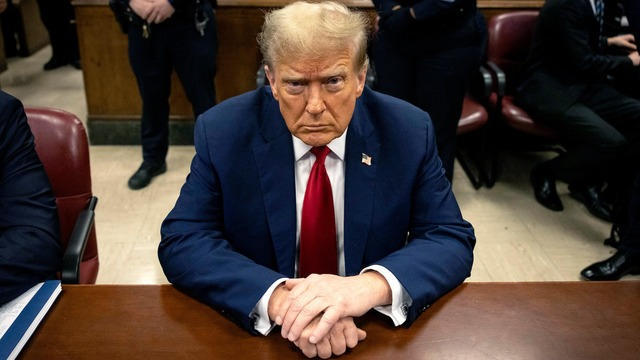
The first witness to testify in former President Donald Trump's "hush money" criminal trial, former CEO of American Media Inc. David Pecker, detailed a "catch and kill" process to prevent negative press coverage. CBS News' Errol Barnett and Graham Kates report.