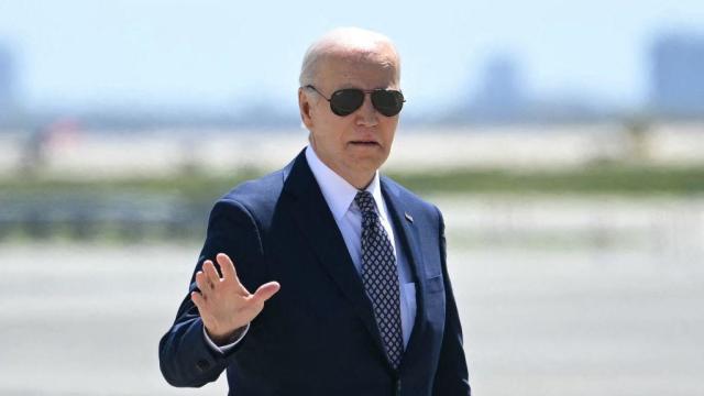
After Biden signs TikTok ban into law, ByteDance says it won't sell
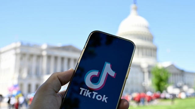
The China-based owner of TikTok is facing a new law that will force it to either sell the wildly popular video platform, or face a U.S. ban.
Watch CBS News
The China-based owner of TikTok is facing a new law that will force it to either sell the wildly popular video platform, or face a U.S. ban.

First known HIV cases from a nonsterile injection for cosmetic reasons highlights the risk of unlicensed providers.

A new rule will affect frozen breaded and stuffed raw chicken products that appear to be fully cooked but are only heat-treated.

The median mortgage payment jumped to a record $2,843 in April, up nearly 13% from a year ago, a new analysis finds.

Travelers often spend more than they need to for airfare, experts say. Here's what to know about paying for add-ons like your seat assignment.
Under the new law signed this week, ByteDance has nine to 12 months to sell the platform to an American owner, or TikTok faces being banned in the U.S.

The income needed to join your state's top earners can vary considerably, from a low of $329,620 annually in West Virginia to $719,253 in Washington D.C.

About 7 in 10 retirees stop working before they turned 65. For many of them, it was for reasons beyond their control.

With a relatively low average monthly cost of living and a low crime rate, this little-known town has a lot to offer retirees according to one report.

Gold can be a smart bet for seniors — and that's not just due to the recent gold price uptick, either.

A HELOC can be a great borrowing option now, but the repayment process is unique. Here's what to know about it.

The average American is currently facing a hefty amount of credit card debt — but there are good ways to tackle it.
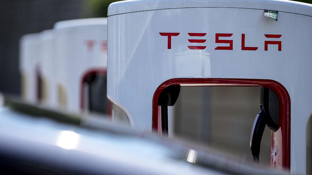
Tesla accounted for 80% of electric vehicle sales in the U.S. in 2020, but that figure fell to 55% last year.
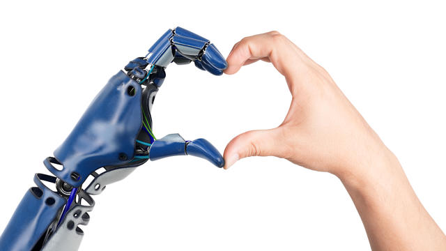
The generative artificial intelligence boom has led to the emergence of romantic companion bots.

Apple said it will stop selling the devices later this month in order to comply with a U.S. import ban.

Alex Jones, the conspiracy theorist known for his fake news site InfoWars and his false denial of the Sandy Hook massacre, was permanently banned from Twitter in 2018.
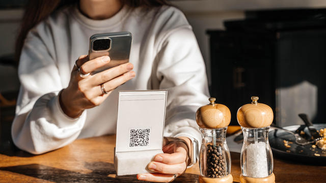
More than 90 million consumers will scan a QR code this year. But the technology can also facilitate identity theft.
The billionaire owner of X took a defensive tone, saying that "the whole world will know that those advertisers killed the company."
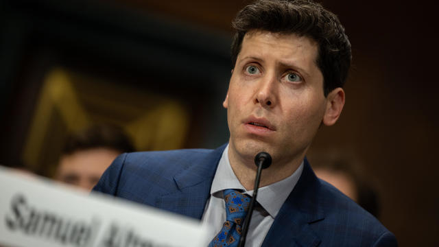
OpenAI co-founder Sam Altman says he's looking forward to returning to the company, with the support of Microsoft's CEO, to build the 2 companies' "strong partnership."

Musk, who is under fire for supporting an antisemitic post, said the money will be donated to hospitals in Israel and to the Red Cross in Gaza.
Altman landed at Microsoft, the biggest investor in OpenAI, as former Twitch leader Emmett Shear was named OpenAI's new chief executive.
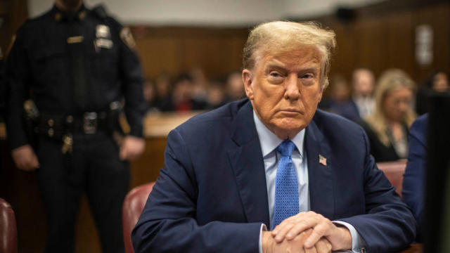
Prosecutors in former President Donald Trump's criminal trial in New York called two new witnesses to the stand on Friday, rounding out the first week of testimony.

Multiple tornadoes were reported in Nebraska and a destructive storm moved from a largely rural area into the Omaha area.
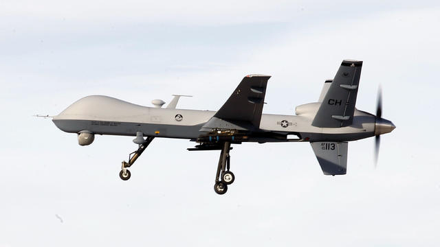
A U.S. MQ-9 Reaper has crashed in Yemen. It may be the third $30 million drone shot down by the Houthis since November.

Around 1 in 5 retail milk samples had tested positive for the bird flu virus, but further tests show it was not infectious.
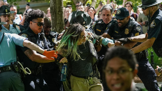
Police are cracking down at some university protests over Israel's war against Hamas in Gaza.
The father of one now faces the potential of a mandatory minimum prison sentence of up to 12 years.
Under the new law signed this week, ByteDance has nine to 12 months to sell the platform to an American owner, or TikTok faces being banned in the U.S.
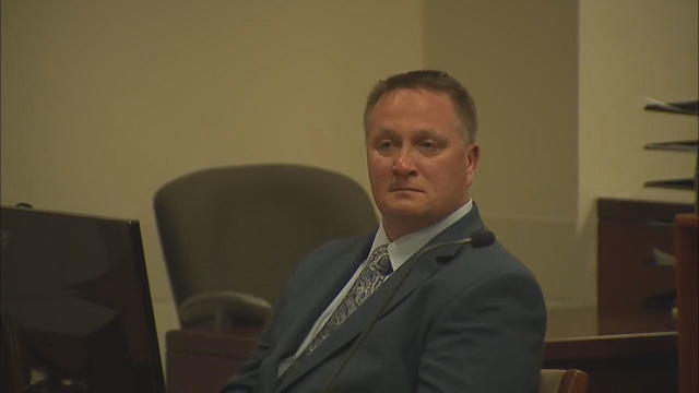
Former Colorado paramedic Jeremy Cooper was sentenced to four years probation, 14 months work release and 100 hours of community service on Friday afternoon.
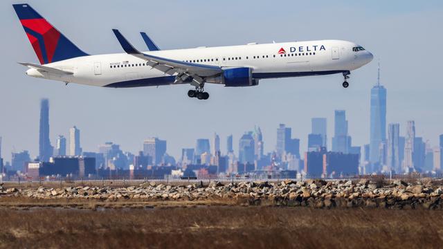
An emergency exit slide "separated" from a Delta flight Friday, prompting an emergency return to New York City's John F. Kennedy Airport.
With a relatively low average monthly cost of living and a low crime rate, this little-known town has a lot to offer retirees according to one report.
The U.S. is reaching "peak 65," marking the largest retirement wave in American history. But the financial outlook for many is grim.

Americans are underprepared for retirement, with the average account holding just $88,400 in savings.
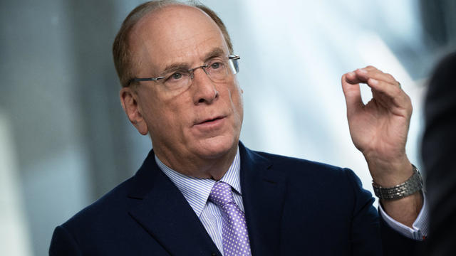
BlackRock CEO Larry Fink said that longer life expectancies are "putting the U.S. retirement system under immense strain."

About 1 in 8 workers think they'll retire by age 61. But the reality of saving for decades of expenses is daunting.
Prosecutors in former President Donald Trump's criminal trial in New York called two new witnesses to the stand on Friday, rounding out the first week of testimony.
Under the new law signed this week, ByteDance has nine to 12 months to sell the platform to an American owner, or TikTok faces being banned in the U.S.
For more than two decades, retired Lt. Gene Eyster wondered what became of that boy he found abandoned in a cardboard box in an apartment hallway.
The father of one now faces the potential of a mandatory minimum prison sentence of up to 12 years.
Around 1 in 5 retail milk samples had tested positive for the bird flu virus, but further tests show it was not infectious.
Under the new law signed this week, ByteDance has nine to 12 months to sell the platform to an American owner, or TikTok faces being banned in the U.S.
The income needed to join your state's top earners can vary considerably, from a low of $329,620 annually in West Virginia to $719,253 in Washington D.C.
About 7 in 10 retirees stop working before they turned 65. For many of them, it was for reasons beyond their control.
With a relatively low average monthly cost of living and a low crime rate, this little-known town has a lot to offer retirees according to one report.
The China-based owner of TikTok is facing a new law that will force it to either sell the wildly popular video platform, or face a U.S. ban.
Prosecutors in former President Donald Trump's criminal trial in New York called two new witnesses to the stand on Friday, rounding out the first week of testimony.
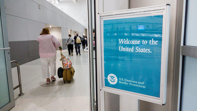
Border officers have broad authority to search travelers' electronic devices without a warrant or suspicion of a crime.
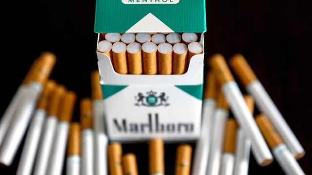
The White House had been due to decide on the menthol cigarette rule in March.
A U.S. MQ-9 Reaper has crashed in Yemen. It may be the third $30 million drone shot down by the Houthis since November.
"I am happy to debate him," President Biden said during an interview with Howard Stern.
Around 1 in 5 retail milk samples had tested positive for the bird flu virus, but further tests show it was not infectious.
The White House had been due to decide on the menthol cigarette rule in March.
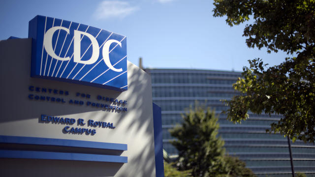
The discovery of drug-resistant bacteria in two dogs prompted a probe by the CDC and New Jersey health authorities.
First known HIV cases from a nonsterile injection for cosmetic reasons highlights the risk of unlicensed providers.
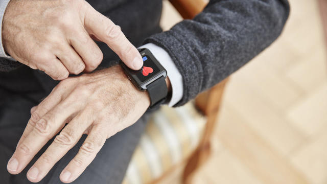
Are you using your smartwatch to the fullest? Here are 4 metrics doctors say can be useful to track beyond your daily step count.
The father of one now faces the potential of a mandatory minimum prison sentence of up to 12 years.
A U.S. MQ-9 Reaper has crashed in Yemen. It may be the third $30 million drone shot down by the Houthis since November.
Police are cracking down at some university protests over Israel's war against Hamas in Gaza.
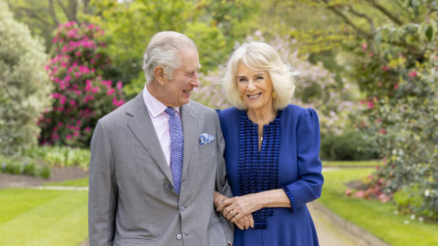
The king took a break from public appearances nearly three months ago after he was diagnosed with an undisclosed type of cancer while he was undergoing treatment for an enlarged prostate.

A gold pocket watch recovered along with the body of John Jacob Astor, the richest passenger on the Titanic, is up for auction.

Fans vote for the award winners — often leading to surprise winners and collaborative performances.

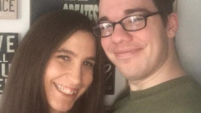
Sophia Bush filed for divorce from entrepreneur Grant Hughes in August 2023 after a year of marriage and started dating the former world champion soccer player afterward.
Preview: In an interview to be broadcast on "CBS News Sunday Morning" April 28, the Oscar-nominated actress also talks about her debut as a singer-songwriter with the album "Glorious."

Looking for a place to live in NYC? Zillow is now listing Frank Sinatra and Mia Farrow's former home on the Upper East Side.
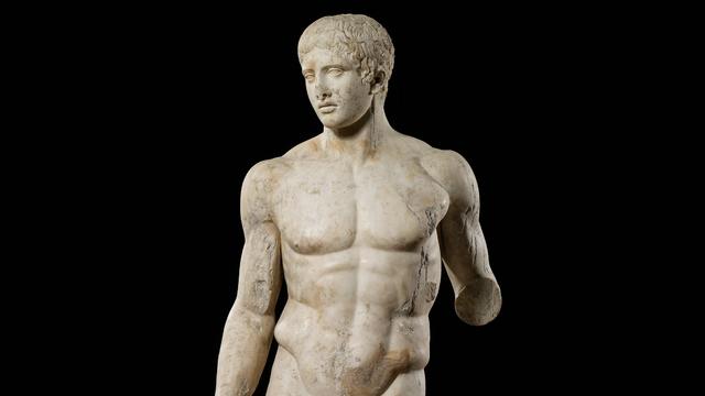
Italy's Culture Ministry has banned loans of works to the Minneapolis Institute of Art, following a dispute with the U.S. museum over an ancient marble statue believed to have been looted from Italy almost a half-century ago.
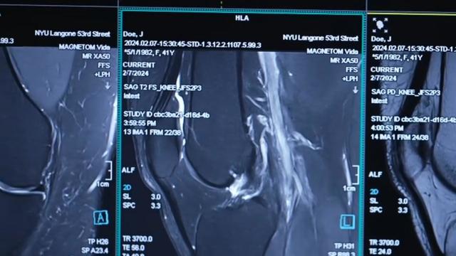
NYU Langone Health and Meta have developed a new type of MRI that dramatically reduces the time needed to complete scans through artificial intelligence. CBS News correspondent Anne-Marie Green reports.
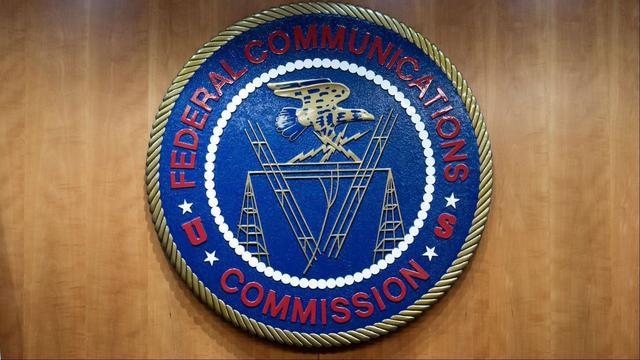
The Federal Communications Commission voted to adopt net neutrality regulations, a reversal from the policy adopted during former President Donald Trump's administration. Christopher Sprigman, a professor at the New York University School of Law, joins CBS News with more on the vote.

From labor shortages to environmental impacts, farmers are looking to AI to help revolutionize the agriculture industry. One California startup, Farm-ng, is tapping into the power of AI and robotics to perform a wide range of tasks, including seeding, weeding and harvesting.
Are you using your smartwatch to the fullest? Here are 4 metrics doctors say can be useful to track beyond your daily step count.

Local and federal authorities face challenges in investigating and prosecuting romance scammers because the scammers are often based overseas. Jim Axelrod explains.
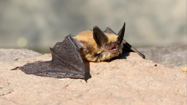
Bats have often been called scary and spooky but experts say they play an important role in our daily lives. CBS News' Danya Bacchus explains why the mammals are so vital to our ecosystem and the threats they're facing.
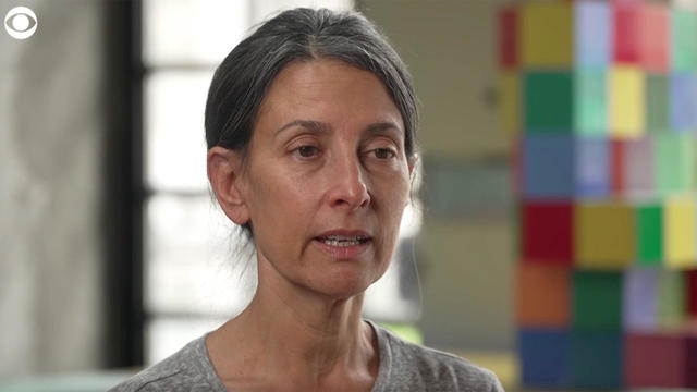
Pediatrician Dr. Mona Hanna-Attisha, whose work has spurred official action on the Flint water crisis, told CBS News that it's stunning that "we continue to use the bodies of our kids as detectors of environmental contamination." She discusses ways to support victims of the water crisis, the ongoing work of replacing the city's pipes and more in this extended interview.
Ten years ago, a water crisis began when Flint, Michigan, switched to the Flint River for its municipal water supply. The more corrosive water was not treated properly, allowing lead from pipes to leach into many homes. CBS News correspondent Ash-har Quraishi spoke with residents about what the past decade has been like.

According to the University of California, Davis, residential energy use is responsible for 20% of total greenhouse gas emissions in the U.S. However, one company is helping residential buildings reduce their impact and putting carbon to use. CBS News' Bradley Blackburn shows how the process works.

Emerging cicadas are so loud in one South Carolina county that residents are calling the sheriff's office asking why they can hear a "noise in the air that sounds like a siren, or a whine, or a roar." CBS News' John Dickerson has details.
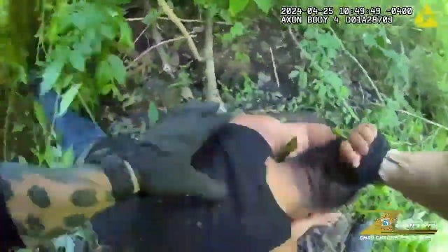
Angel Gabriel Cuz-Choc was found hiding in a wooded area after his girlfriend and her 4-year-old daughter were found dead in Florida.
Dramatic bodycam footage shows the moment Florida deputies and K-9 dogs close in on a double murder suspect hiding in a thickly wooded area.
A new "48 Hours" investigation is looking into the death of a Kansas woman after she was found dying from a gunshot wound in 2019. The coroner initially ruled Kristen Trickle's death a suicide, but the local prosecutor said evidence on the scene didn't add up. "48 Hours" correspondent Erin Moriarty has the story.
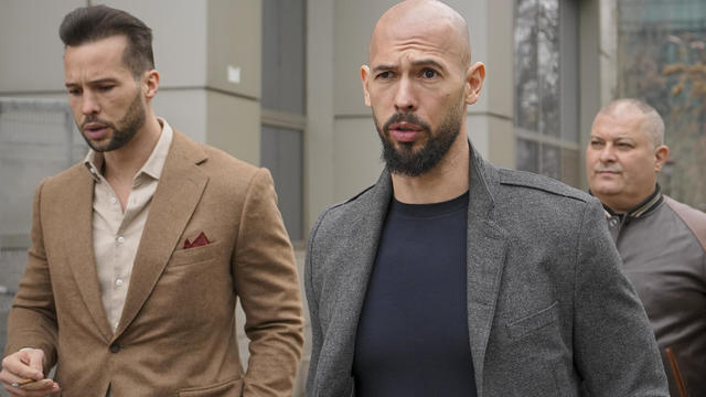
A Bucharest court has ruled that a case against social media influencer Andrew Tate meets the required legal criteria and can go ahead, but there's no date set yet.
After Kristen Trickle died at her home in Kansas, her husband Colby Trickle received over $120,000 in life insurance benefits and spent nearly $2,000 on a sex doll supposedly to help him sleep.
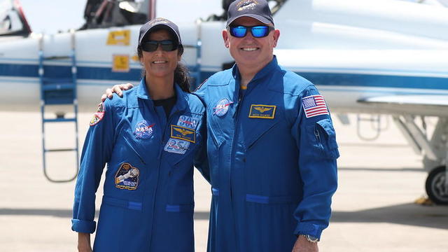
Astronauts Barry Wilmore and Sunita Williams say they have complete confidence in the Starliner despite questions about Boeing's safety culture.
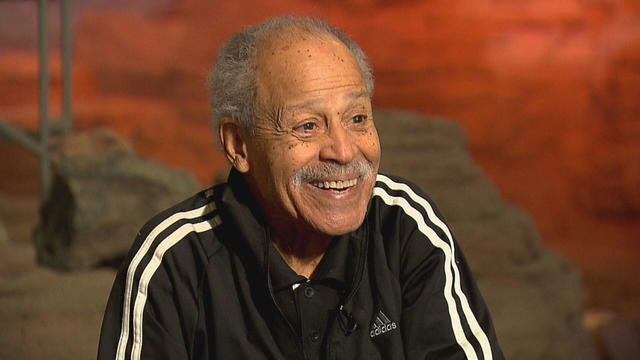
In 1961, Ed Dwight was selected by President John F. Kennedy to enter an Air Force training program known as the path to NASA's Astronaut Corps. But he ultimately never made it to space.

The creepy patterns were observed by the European Space Agency's ExoMars Trace Gas Orbiter.

The Shenzhou 18 crew will replace three taikonauts aboard the Chinese space station who are wrapping up a six-month stay.

In November 2023, NASA's Voyager 1 spacecraft stopped sending "readable science and engineering data."

A look back at the esteemed personalities who've left us this year, who'd touched us with their innovation, creativity and humanity.

The Francis Scott Key Bridge in Baltimore collapsed early Tuesday, March 26 after a column was struck by a container ship that reportedly lost power, sending vehicles and people into the Patapsco River.
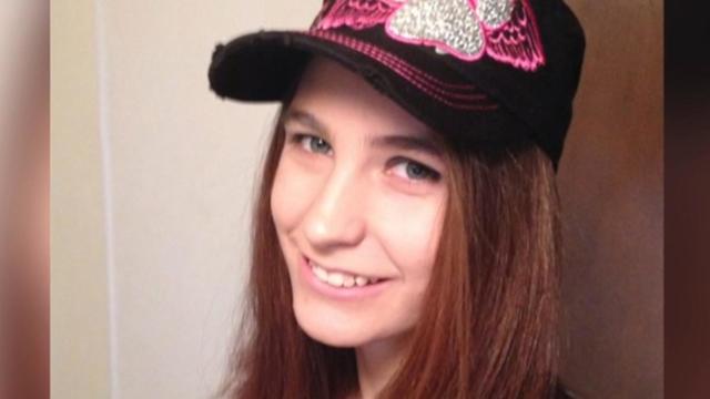
When Tiffiney Crawford was found dead inside her van, authorities believed she might have taken her own life. But could she shoot herself twice in the head with her non-dominant hand?
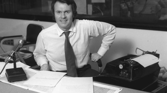
We look back at the life and career of the longtime host of "Sunday Morning," and "one of the most enduring and most endearing" people in broadcasting.

Cayley Mandadi's mother and stepfather go to extreme lengths to prove her death was no accident.
For more than 200 days after Hersh Goldberg-Polin was taken hostage by Hamas on Oct.7, his mother hadn't heard his voice or seen video that proved he was alive. But that changed this week, when Hamas released a propaganda video showing Hersh – an Israeli-American – alive with his left arm amputated. CBS News' Debora Patta sat down with his mother, Rachel Goldberg-Polin, to ask about the "overwhelming and emotional" moment she saw that video and how she hopes all parties involved can reach a compromise to end the suffering.
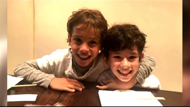
Meet high school freshmen Joshua Small and Alexander Morris, a dynamic duo making a difference in their New York city community. The two long-time friends are teaming up to raise money to help young cancer patients and their families.
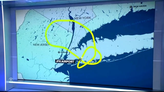
A Delta Air Lines flight en route to Los Angeles was forced to circle back to New York's JFK International Airport Friday morning after it dropped an emergency exit slide.
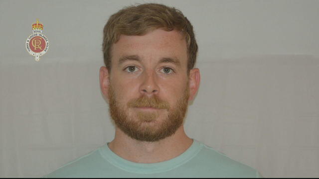
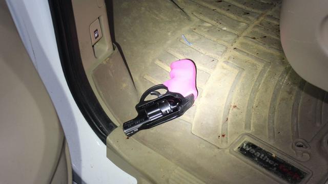
Another American has been arrested in the Caribbean territory of Turks and Caicos after ammunition was allegedly found in his luggage. The Virginia man is the fourth American detained under similar circumstances in the last several months. Kris Van Cleave has more.
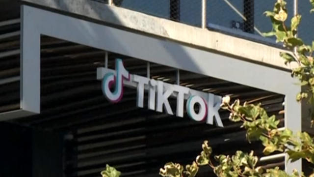
With the clock ticking on TikTok, millions of users, including small businesses, are scrambling to figure out what to do next. Jo Ling Kent reports.